Hey friends.
The statistics on this blog say hundreds of you visit this blog weekly. Thanks so much.
If you noticed, I started blogging 5x a week in January and stopped for the summer. Then when I got back it was fall and work, family, and coaching hit the full swing of fall and I got considerably more inconsistent. Then the demands of several other writing contracts hit and well, I failed at blogging.
The main conflict with carving out time to blog was finding time to carve out time to write as I’ve been in the crunch season of my first “real book” that’s due out early next year.
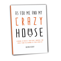
It’s titled “As for me and my crazy house” and is tagged “Learning to protect your heart, marriage, and family from the demands of ministry”.
I’ll blog some more about it soon and am turning in my manuscript to the publisher today. But in the meantime, I need some cover feedback. I have one art piece from the publisher and one from a friend and I’m looking for your votes. It won’t tell you who did what or which one I like and why, but I’m wondering what you think. If you click on either of them you should get a bigger picture to view.
We’ll call this one COVER 1- the door.

We’ll cal this one COVER 2- the house.

So how about it? Which one do you like? Any feedback on colors and such? Go ahead and comment away, I’d love to hear your thoughts.
 Husband. Dad to 5. Student Ministry Pastor. Follower of Jesus. Yatta yatta.
I like ’em both, but for entirely different reasons.
Cover 1 is more interesting with the picture of the door and the different font for “Crazy.” For some reason, it feels like the cover of a memoir.
Cover 2 is more simple and streamlined, which has the feel of a business book. So it depends on what you’re wanting to communicate.
Most importantly, I like that I get to buy/read/recommend your book in the near future. 🙂
#1’s font is hard to read. #2 is much easier to read, especially if it was on a shelf! The orange stands out more and communicates “crazy” more to me than the blue.
I like Cover 2 with the orange. Does feel a bit business/leadership-ish, but I’m not a huge fan of the door one.
Like #2 better.
#1 has some grid problems that draw my eye to crazy things. Also, the typography is a bit hard to read and troublesome.
# 2 is better, though a bit generic. Typography is more readable and is more peasant to the eyes. Orange makes sense to my psyche.
They are both alright, but I would use something a bit more graphic, like a colorful house in the background and a family in the foreground.
cover 2 orange
– will sell better, you need to support those kids.
– the book is supposed to be giving advice/suggestions and COVER 2 orange would be read by me for those reasons
– I wouldn’t touch cover 1 seems too touchy feely
I like number two! It is easier to read (and we all know I am going blind)
You can do better than either of these, for real. They are both low-effort generics. A good designer could do both in about forty seconds grand total.
I’m going number one simply because it has a graphic. However, I think the key component that isn’t communicated well in either design is CRAZY. Just a different font isn’t enough. Something in the background should illustrate crazy better.
#2 is way easier to read! That’s my vote!
BTW, I don’t mean to be mean about it. Your writing says that either (a) you are very good or (b) you work very hard at it or (c) both. Your design work should show the same quality, and these covers just don’t convey that.
I used to have a boss that no matter what I did when designing something, I knew he would have me make changes. I never once got something approved on the first draft. I started just throwing something together and taking it to him so that I could get his ideas before I put a lot of effort into it. These covers look like they had the same idea. They may be starting points, but they aren’t finished products.
Mom likes the eye-catching concept of the door, but I think it needs different fonts to make it easier to read. The sub-title on number two is really minimized. You can’t judge a book by its’ cover, but the cover can sure help catch the eye of a potential buyer. Dad.
I like #1 because of the door way to the house, but the title doesn’t stick out very much. I like the title for #2 but then the rest looks very basic. Not really sure…I guess if I had to choose, I’d go with #2 but you might want to get another design. Can’t wait to read it!
I prefer cover 2 orange, but might like cover 1 if there was a different font.
# 2 for sure…to me the first cover looks like it would have fit well in the early 2000’s but with design now days I think # 2 fits best.
#1 just doesnt seem finished to me, looks to flat. I like the basic concept with the door but i think it could be better.
As a designer myself #2 more appealing as a design.
thanks for all the feedback friends. we’re still in the midst of design decisions. We’re not doing #1 and going to try and find something that captures the essence of what you’ve all said. Once I get another image or two from the publisher, I’ll toss them up here again.